Sunday, December 11, 2011

How to Design and Write Web Pages Today by Karl Stolley


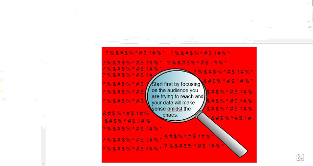
The graphic above shows that there is an immense amount of data on the Internet today. However it is useless to put information on the Internet without a proper analysis of the audience you are trying to address.
Thus, designing and writing web pages are a daunting task and is turning into a task that is becoming more common to more and more companies today. Therefore, this book is broken into four parts to help attack this issue:

Part I: What am I Writiing?
Part II: Issues and Challenges
Part III: Strategies for Success
Part IV: Problems and Solutions


Throughout the book, the reader will learn how to use WordPress, the importance of languages such as XHTML and CSS, how to design a web page, and many more. 

Here is the link to my full book review: 
http://docs.google.com/document/d/1OYOKR0dYePynOhE38CCYszDPC2TV7GVo8UCSygNrJYQ/edit 
Friday, December 9, 2011

Information Architecture for the World Wide Web, 3rd Ed.

When I first saw "World Wide Web" in the title of the book that I was assigned, I cringed. I thought, "I'm no web guru, this book is going to make no sense to me."After reading it, though, this book is not meant to apply ONLY to the web. In fact, the authors go through multiple aspects of Information Architecture that can be applied to any field.

The largest emphasis of the book is the idea of an Information Ecology. That is, the relationships between the user, the content, and the context. In all documents and products, this relationship is malleable and organic - it is something that we, as Information Architects and Professional Writers need to be aware of and try to master. Successful end products, good Information Architecture, and happy stakeholders, result from researching about each of the three parts of the Information Ecology.

The book also goes deep into the heart of what Information design really is and how to explain it to others. This is the sort of introduction that people who are new to the field need to have. This book spells the basics out in interesting and helpful ways that I wish I had in front of me when I entered the field.

For a full review of Information Architecture for the World Wide Web, 3rd Ed please follow the link below:
https://docs.google.com/document/d/1G_GQxezGWLwLlSgxdOgSVhdQhVe841l6nApedCcrrMY/edit

Review of Brandscapes by Anna Klingmann

The experience economy is marked by brandscapes, which employ elements of information design and user-centered design. The author gives many examples of how companies create brands and the consumers who can't get enough of them. I suggest the book to anyone who is interested in branding and architecture.


For my book review: https://docs.google.com/document/d/1epm8i4MHpVT4md6XvEydDAZsnjeNRI8M4AY9-ZZtVAA/edit

For my presentation: https://docs.google.com/open?id=0B-Qz-MQA15ynNjljNjQ2ZDUtMmQzZi00ODJlLTg4MjItMjNmODk4MGM1Mzg0

Thursday, December 8, 2011

"A Pattern Language: Towns Buildings Construction"

Full review can be found here: Full_Review
Visual presentation can be found here: Visual_Presentation

"The Wayfinding Handbook" by David Gibson

Below are my final products for the book, "The Wayfinding Handbook" by David Gibson. My visual representation is a powerpoint presentation, because it effectively allows my audience to gain insight and knowledge about my text in a concise and cohesive manner, allowing each side to discuss a significant concept from the text. My book review provides the audience with an in depth explanation of the concepts covered within the text, and their significance to professional writing students and the industry at large.

In regards to the actual text, "The Wayfinding Handbook" is a very innovative read, because it discusses how the universal concept of information design can be so versatile, in this book particularly, through the concept of wayfinding. Wayfinding in short refers to creating visually competent, concise, cohesive yet detailed signage, planning and community development. It is an interdisciplinary subject because it encompasses aspects from professional writing, arcitecture and visual design, graphic design, and cartography. It presents information that is very valuable because this field and industry provide professional writing students a new opportunity to utilize their major and possibly acquire jobs post graduation.


The above is my powerpoint visual representation of this text.


This is my in depth book review for the text.

Reality is Broken by Jane McGonigal


In Reality is Broken, Why Games Make Us Better and How They Can Change the World by Jane McGonigal there is an impressive amount of statistics about the amount of time the average gamer plays video games. In fact, the amount of time is so impressive that it has led Jane McGonigal to come to the conclusion that reality is broken and therefore people have turned to virtual worlds to satisfy their worldly needs. 

From this idea, McGonigal further discovered that there is a ridiculous amount of human participation hours being committed to playing a single game: World of Warcraft. On average gamers are committing 210 participation hours per week to playing WoW. This visual is meant to be a story board of a greater visual that has the potential to show an overwhelming statistic and what that number could mean if it were applied to worldly problems outside of gaming. 

Included after the jump is a review of the book and how McGonigal's evaluation that video games and gamers are the future of our society can be applied to professional writers. This review is intended for all audiences, but is specifically geared towards helping people outside of the profession to understand the specifics of how a professional writer creates and designs successful documentation.

Information Archetechture: Blueprints for the Web Review


Imagine your company decides it needs a website, imagine that you draw the short straw, and imagine you have no clue whatsoever where to start or how you are going to make it through this. People in this position (as well countless similar ones) and many others who simply do not know where to start or simply want to know more about effective web-site design will benefit greatly from Christina Wodtke’s Information Architecture: Blueprints for the Web. While this a very much book for beginners, some more experienced people will find good advice here too as it lays out a framework of good practices rather than a step-by-step “for dummies” guide.


The first thing the book does is draw a distinction between a myriad of “proper web design laws” written by web “gurus” and real world. There are no cut and dry design laws, if it were that simple she wouldn’t have the need to write the book and the job would be so much easier. But we all know it is not, what worked for one company and that “guru” made into a “law” will not necessarily work for you. Therefore do not just blindly accept any such laws you may run across.
Perhaps the most important point that is made in Information Architecture is regarding user-centered design. The author of the book conveyed one message very clear – do not guess on what your users may or may not like and build a website based on that. Bottom line is that you have to talk to the potential end users to get the answers you need. Not following this particular guideline can cost you both many hours of work and tons of money. Simply put it is a gamble you cannot afford. If you guess right, you will save yourself time you would spend on research. However, if you guess wrong, you will likely have to re-design almost the entire site. In addition, history shows that the latter is a more likely outcome, thus making the choice very easy – do your research!


Here is the link to the full review:


And here is the link to the presentation: